I clearly have been missing in action. Life has been busy and hectic. I have been sneaking some scrapping in here and there and still working on that friends pregnancy album - it is taking me forever and I am loosing interest :-/
I also have 2 layouts that I started but haven't finished yet. I know exactly what I want to do with them but haven't had the energy to actually do it - I guess I am in a funk. But I did a few layouts last month that I have not posted here yet and will now. Enjoy!
2 Picture Layouts:
Coloring Easter Eggs:
Here I found the cutest Easter 12x12 paper but instead of placing my pictures directly onto that (I thought it would have been 'too much')) I centered a bright yellow card stock to bring out the yellow Easter Eggs and them matted the pictures with green cardstock that matches the green grass in the 12x12 paper.
I added green chipboard corners in different sizes for a little 'extra' effect. The Happy Easter stickers is from Soft Spoken and I used eggs stickers as letters in the word coloring in my title. I think it came out fantastic. And these photos are from Easter 2008.
The Outdoors:
I found this great line at Michaels called Friendly Forest Friends. The cutest line ever! I bought a bunch of the embellishment sets as we all the paper pack. It seems more Fall oriented but I was able to use it now.
As I finshed this layout I kept looking at it because I knew and still know it is missing something but can't put my finger on what. But I am the type of person, once I say I am finished with a layout, there is no going back.
The only exciting thing about this layout, well for me anyway, is the tree. It was a stamp part of this collection and I embossed it.
My first double page layout:
I have always been aprehensive about doing a 2 page layout. The thought of it always frightens me and I am not sure why. This time I did, a guess you would call it a modified 2 page layout? The 2 pages are the same theme and event but I didn't not combine them and have them bleed together - does that make sense?
I am really happy on how these came out. They are really colorful and show how much fun we had at the Circus this year.
The paper I used is from the "All About Boys" Stack by DCWV. There are really great papers in this stack - can't wait to get to use more of them!
I saved our tickets stubs and added them to page 1. I like adding that because all the details are there and I don't have to do too much journaling.
I had saved my popcorn box from the show and cut out with my Fiskars Circle punch, the Ringlin Bros and Barnum and Bailey Circus logo. You can see that on page 1. I put adhered it with 3d dots.
And on page 2, I also cut out the Circus name as well as the logo again.
Page 1

Page 2

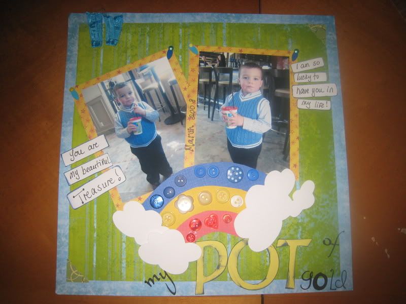
1 Picture Layout:
His Gal Pal
I was told by a friend that this layout was too busy. It might be but I like it and I like how I coordinated all of it. But I am disappointed on how I placed my journaling circles on the layout. Once I got it down, I couldn't get it back up without ripping the paper.
Almost everyone one the below layout are from Fancy Pants Designs "All About a Boy". The transparancy is my favorite part. I have owned that piece for a long time but never knew how to use it and I think it looks perfect here :)


.jpg)
.jpg) The background paper on there is a gorgeous grass scence with Easter Eggs - simply gorgeous but also a bit overpowering to put pictures directly on it... at least in my opinion. I choose a yellow paper with little blue swirls on it and cut it down as the center of the layout. I added green chipboard corners, big and small for contrast. I cut out the title using my Cricut Zooballoo cartridge (I have a bunch of carts but I love the font on the Zooballoo). I used Sandylion Essential 'Easter Eggs' as the letter O in 'Coloring'.
The background paper on there is a gorgeous grass scence with Easter Eggs - simply gorgeous but also a bit overpowering to put pictures directly on it... at least in my opinion. I choose a yellow paper with little blue swirls on it and cut it down as the center of the layout. I added green chipboard corners, big and small for contrast. I cut out the title using my Cricut Zooballoo cartridge (I have a bunch of carts but I love the font on the Zooballoo). I used Sandylion Essential 'Easter Eggs' as the letter O in 'Coloring'.
.jpg)
.jpg)

.jpg)


.JPG)
.JPG)


.jpg)

 I ended up buying the entire
 .jpg)


.JPG)


.jpg)


